
概要
この記事を書いたきっかけは、ゲームの紹介ページとかで文章が斜めになっているページを見たからです。
昔のものは画像でそのページを作成したりしていましたが、HTMLで書かれているものを見つけ「どうやっているんだろう?」と思い調べ書きました。
どうやれば良いのか?
CSS transform: rotate() を利用する。
ざっくり解説
transform は要素に 2D または 3D 変形を適用するためのプロパティで、rotate()の関数を利用することで要素を指定された角度だけ回転(傾け)させることができます。
例えば値に4degを指定することで、該当要素を時計回りに4度回転させることができます。
回転の中心:デフォルトでは、要素の中心を軸として回転します。
正の値と負の値:
- 正の値(例:4deg)は時計回りの回転を示します。
- 負の値(例:-4deg)は反時計回りの回転を示します。
単位:
- deg(度): 最もよく使われる単位です。360度で一周します。
- rad(ラジアン): 2πラジアンで一周します。
- turn: 1turnで一周します。
できるもの
PCレイアウトを基本にしていますが、メディアクエリでレスポンシブ対応にしています。
そういうゲームなのでボイス等の再生機能も実装しています。
フレームワークやライブラリと利用せずpureなもので記載しています。
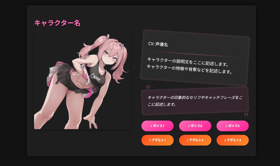
画像に関しては以前に生成したメスガキちゃんのものを利用しています。
コード関連
- ディレクトリ構造
.
├── Index.html
├── character1_adult_voice1.mp3
├── character1_adult_voice2.mp3
├── character1_adult_voice3.mp3
├── character1_voice1.mp3
├── character1_voice2.mp3
├── character1_voice3.mp3
└── placeholder_full.jpg- 実際のコード
<!DOCTYPE html>
<html lang="ja">

<head>
  <meta charset="utf-8">
  <meta name="viewport" content="width=device-width, initial-scale=1">
  <title>キャラクター紹介|ゲームタイトル</title>
  <link href="https://fonts.googleapis.com/css2?family=Noto+Sans+JP:wght@400;700&display=swap" rel="stylesheet">
  <style>
    body {
      font-family: 'Noto Sans JP', sans-serif;
      background-color: #121212;
      margin: 0;
      padding: 0;
      color: #e0e0e0;
    }

    .character-container {
      display: flex;
      justify-content: center;
      padding: 20px;
    }

    .character {
      background-color: #1e1e1e;
      border-radius: 10px;
      box-shadow: 0 0 20px rgba(0, 0, 0, 0.5);
      margin: 20px;
      padding: 30px;
      width: 900px;
    }

    .character-header {
      margin-bottom: 20px;
    }

    .character-name {
      font-size: 28px;
      font-weight: bold;
      color: #ff69b4;
      text-shadow: 2px 2px 4px rgba(0, 0, 0, 0.5);
    }

    .character-content {
      display: flex;
      justify-content: space-between;
    }

    .character-image-container {
      width: 45%;
    }

    .character-image {
      width: 100%;
      height: auto;
      border-radius: 5px;
      box-shadow: 0 5px 15px rgba(0, 0, 0, 0.3);
    }

    .character-info-container {
      width: 50%;
    }

    .character-profile {
      margin-bottom: 20px;
    }

    .profile-text {
      transform: rotate(4deg);
      background-color: #2a2a2a;
      color: #e0e0e0;
      padding: 25px;
      font-size: 1.1em;
      line-height: 1.7em;
      border-radius: 10px;
      box-shadow: inset 0 0 10px rgba(255, 105, 180, 0.2);
    }

    .profile-text hr {
      margin: 10px 0;
      border: none;
      height: 1px;
      background: linear-gradient(to right, transparent, #ff69b4, transparent);
    }

    .voice-samples {
      margin-top: 20px;
    }

    .voice-sample-row {
      display: flex;
      justify-content: space-between;
      margin-bottom: 15px;
    }

    .voice-button {
      background: linear-gradient(145deg, #ff69b4, #ff1493);
      color: white;
      border: none;
      padding: 12px 15px;
      cursor: pointer;
      border-radius: 25px;
      width: 30%;
      font-weight: 700;
      transition: all 0.3s ease;
      box-shadow: 0 4px 6px rgba(0, 0, 0, 0.1);
    }

    .voice-button:hover {
      transform: translateY(-2px);
      box-shadow: 0 6px 8px rgba(0, 0, 0, 0.2);
    }

    .voice-button:disabled {
      background: linear-gradient(145deg, #4a4a4a, #3a3a3a);
      color: #808080;
      cursor: not-allowed;
    }

    .voice-button.adult {
      background: linear-gradient(145deg, #ff4500, #ff8c00);
    }

    .voice-button.adult:disabled {
      background: linear-gradient(145deg, #4a4a4a, #3a3a3a);
    }

    .character-quote {
      margin-bottom: 30px;
      position: relative;
    }

    .quote-text {
      background-color: rgba(255, 105, 180, 0.1);
      color: #e0e0e0;
      padding: 25px;
      font-size: 1.0em;
      line-height: 1.8em;
      border-radius: 10px;
      box-shadow: inset 0 0 10px rgba(255, 255, 255, 0.1);
      transform: rotate(-2deg);
      font-style: italic;
    }

    .quote-text-content {
      transform: rotate(2deg);
    }

    .quote-text::before,
    .quote-text::after {
      content: '"';
      font-size: 3em;
      position: absolute;
      color: rgba(255, 105, 180, 0.3);
    }

    .quote-text::before {
      left: 10px;
      top: -10px;
    }

    .quote-text::after {
      right: 10px;
      bottom: -40px;
    }

    @media (max-width: 768px) {
      .character {
        width: 100%;
      }

      .character-content {
        flex-direction: column;
      }

      .character-image-container,
      .character-info-container {
        width: 100%;
      }

      .voice-sample-row {
        flex-direction: column;
      }

      .voice-button {
        width: 100%;
        margin-bottom: 10px;
      }
    }
  </style>
</head>

<body>
  <div class="character-container">
    <div class="character">
      <div class="character-header">
        <h2 class="character-name">キャラクター名</h2>
      </div>
      <div class="character-content">
        <div class="character-image-container">
          <img class="character-image" src="placeholder_full.jpg" alt="キャラクター全身像">
        </div>
        <div class="character-info-container">
          <div class="character-profile">
            <div class="profile-text">
              <div class="profile-text-content">
                <p>CV: 声優名</p>
                <hr>
                <p>
                  キャラクターの説明文をここに記述します。<br>
                  キャラクターの特徴や背景などを記述します。
                </p>
              </div>
            </div>
          </div>
          <div class="character-quote">
            <div class="quote-text">
              <div class="quote-text-content">
                キャラクターの印象的なセリフやキャッチフレーズをここに記述します。
              </div>
            </div>
          </div>
          <div class="voice-samples">
            <div class="voice-sample-row">
              <button class="voice-button" onclick="playVoice('character1_voice1.mp3')">♪ ボイス1</button>
              <button class="voice-button" onclick="playVoice('character1_voice2.mp3')">♪ ボイス2</button>
              <button class="voice-button" onclick="playVoice('character1_voice3.mp3')">♪ ボイス3</button>
            </div>
            <div class="voice-sample-row">
              <button class="voice-button adult" onclick="playVoice('character1_adult_voice1.mp3')">♪ アダルト1</button>
              <button class="voice-button adult" onclick="playVoice('character1_adult_voice2.mp3')">♪ アダルト2</button>
              <button class="voice-button adult" onclick="playVoice('character1_adult_voice3.mp3')">♪ アダルト3</button>
            </div>
          </div>
        </div>
      </div>
    </div>
  </div>

  <script>
    function playVoice(audioFile) {
      let audio = new Audio(audioFile);
      audio.play();
    }
  </script>
</body>

</html>
最後に
いつもさらっと見ているものを再現してみましたが、存外CSSの要素を結構書く必要があったのが結構面倒でした。
もっとこういうのに特化したフレームワークがないか少し探してみたいと思います。
以上、どなたかのお役に立てば幸いです。